
You’ve been asking for it, we listened, and we delivered!
Ever since our version 1, a lot of people have been asking a way to see where their money goes. We knew how to achieve this and to be honest, it’s been part of our plan even from the start. We just had to attend to the most critical pieces and base foundations.
Categories
In order to show you where your money goes in a diagram, there has to be a way to categorise your transactions first. This is why we’ve built the categorization feature!
How it works
On desktop, you can right click on any transaction row.
On mobile, you can expand the accordion (click the down arrow on the right of a transaction item) and you will see “Edit transaction”.
Important
This powerful new capability is currently available to all users as an exclusive early access preview!
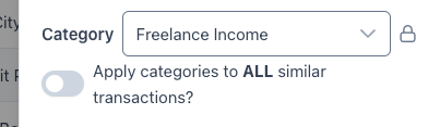
When you avail of the categorization feature, you will be able to categorise your transactions one by one. You can easily and quickly apply the same category to similar transactions in your application:
In our future feature deployments, we will have an AI auto-categorization feature. We’re sure you’d enjoy that so our small-but-mighty team are scrambling away to get to that point while attending to our other product priorities!
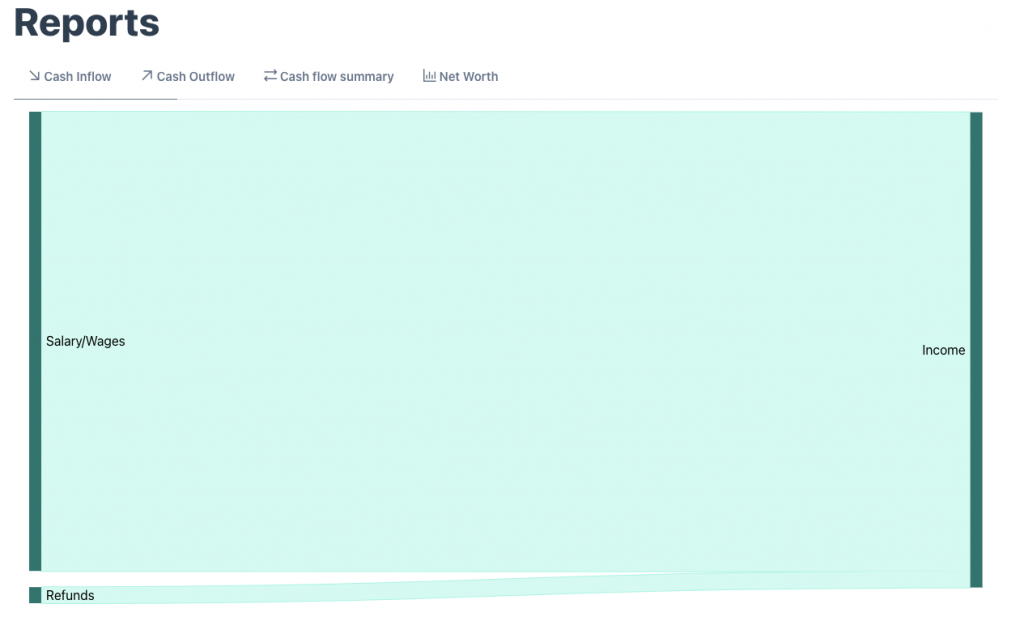
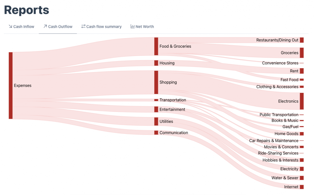
Sankey (Flow) diagram
After all your transactions have been categorised, you will now be able to see them in the “Flow” diagram (Reports → Cash Inflow or Outflow)
Here are some examples:
Important
This powerful new capability is currently available to all users as an exclusive early access preview!
How it works
You just have to categorise your transactions to a category and then the flow diagram does the rest!
Be a Founding Member: Sign up now for early access, exclusive deals, and help shape our future!
The little “oopsie” here is that we have not built the date range selector yet 😅 So currently it’ll show you the in and outflows of your money of all the transactions, of all times. We’re aware of this and we’re building and releasing this addition soon!
Summary
You can now categorise your transactions and you can view them in a flow diagram; both to show the inflow and outflow of your money.