
So you’ve been using responsive design via CSS when you’re coding. You want to push it to the next level by loading properly sized images on certain device widths so you don’t load extraneous kb’s of file size. That’s great and smart. That’s where
Code breakdown
Example code snippet:
![]() srcset="https://via.placeholder.com/375.jpg 375w, https://via.placeholder.com/1024.jpg 1024w"
sizes="(max-width: 400px) 300px, 1024px"
src="https://via.placeholder.com/375.jpg"
/>
srcset="https://via.placeholder.com/375.jpg 375w, https://via.placeholder.com/1024.jpg 1024w"

sizes="(max-width: 400px) 300px, 1024px"

src="https://via.placeholder.com/375.jpg"

/>
(This is all written in one line but I’m spacing it for readability)
As you can see, there are three attributes to make this work: srcset, sizes, and src.
src
Let’s start with the src="". It’s the easiest and the way it functions is exactly the same like a normal srcset and sizes gets processed and the src gets ignored.
On the other hand, if you’re using the problem child IE11, which does not support srcset, then it ignores the two, and just runs src like a normal image. So in a sense srcset is universally compatible with a graceful fallback for IE11.
srcset
srcset="https://via.placeholder.com/375.jpg 375w, https://via.placeholder.com/1024.jpg 1024w"srcset is the attribute where you specify the available images in different sizes.
Translated in english, this means:
https://via.placeholder.com/375.jpg is you specifying the location of the image while375w is you specifying the intrinsic/natural width of the image. Yes, that’s intentionally w, not px, not any other unit. Mozilla MDN about srcset explains why.
Second value is the same logic. So basically srcset is where you would specify the “small, medium, large” versions of your thumbnail.
You can also have an srcset attribute (without sizes attribute) and it’ll totally work and be valid. The confusing part here is that you’re just indicating to the browser the available image options. The browser actually automatically figures out what is the best image to load by itself. You can hack/guide the logic by using the sizes attribute. Without it, the browser’s ok running auto.
Pro-tip: relative pathing
For some reason, relative pathing doesn’t work within the srcset. I also did this locally so I’m not entirely sure if it’s an HTML problem or local/machine/mac problem.
If I write 
BUT if I write

I am using Mac/Chrome.
sizes
srcset is way easier to understand compared to this bugger. If you’re having problems making srcset work, chances are it’s this problem child.
sizes="(max-width: 400px) 300px, 1024px"Pro-tip: sizes has nothing to do and is NOT connected in any way with srcset
^remember that statement. If you’re like me, I misunderstood the sizes attribute the first time around. The sizes attribute is not an instruction to the browser to instruct it which image to use.
If I translate the snippet in english:
“If the browser width is 400px or less, the size of the image SLOT(not the image itself) that will be used should be 300px. All else, size it as 1024px.”
There’s a lot to unpack here:
- first, notice that we haven’t indicated WHICH image size to use. You probably want to manipulate this and we’ll get back to this soon.
- you can have multiple media queries in this attribute; just separate them with commas
- as you can see, the last one has no conditional statement. It’s basically the
elseof the condition: “if the preceding conditions were not met, do this instead” - Here you can use
px,em,vwunits of measurement, but NOT %. - Notice that in our
srcset, we didn’t really provide an image that is 300px in size. We have 375px though. This is ok. See next subheader.
Now let’s focus on the 300px part of the sizes="(max-width: 400px) 300px, 1024px" statement.
If you’ve specified an image in the srcset with the width of 300w, this does NOT mean:
“if the browser width is 400px or less, use the 300px wide image”. Again, sizes has nothing to do with srcset.
What this actually mean is:
“whatever image you end up selecting Mr. Chrome, render it as 300px on the frontend” (yes, you still haven’t manually indicated which image/size to use).
This is the same as having:

Yes the image being loaded is 1000px x 1000px, but it’ll be drawn as a 200×200 box.
“So how do you tell browser which image to use?!”
It is the sizes for sure and I’ve mentioned it already briefly. It just needs explanation.
Notice that in our srcset, we didn’t really provide an image that is 300px in size. We have 375px though. This is ok. If you specify an image slot size and there’s no corresponding image for that exact size, it’ll use the next best, closest image size ABOVE it. E.g.: if you’ve specified three image in the srcset with the following sizes: 299px, 300px, and 350px, the 350px will be used.
So this is actually how you control it. If you have an image that’s 300px in size and you want it to be used for mobile layouts (and for the sake of simplicity you have a 1000px image to be used for everything else–tablet to desktop–), You would then write:
![]() https://xxx.com/thumbnail-1000.jpg 1000w" sizes="(max-width:400px) 300px, 100vw" />
https://xxx.com/thumbnail-1000.jpg 1000w" sizes="(max-width:400px) 300px, 100vw" /> https://xxx.com/thumbnail-1000.jpg 1000w" sizes="(max-width:400px) 300px, 100vw" />
In english this means:
- I have two images (srcset), one’s 300 wide, the other 1000w
- if the browser width is 400px or less, the image will be rendered as 300px
- which image to use? the browser will use the 300px reference and look at your srcset.
- if you have an image that’s also 300px, it’ll use that
- if you don’t, it’ll use the next biggest one
- for all else, whatever image size you use, display it as 100% viewing width (as big as whatever screen being used)
- so in this case if the browser width is 401px or more, it’ll use the
1000wimage
- so in this case if the browser width is 401px or more, it’ll use the
Pro-tip: your ![]()
Here’s the fucker that burned some much time for me.
If you’re like me and you’re coding and testing it with Chrome + dev tools and you’re in the responsive layout continuously dragging the size of the responsive layout from mobile to desktop and back, AND it seems to ONLY load the desktop/biggest image only, even if you’re in mobile layout width, you wanna know why?!
…because fucking DISK CACHE.
Try this: open up your dev tools and adjust the responsive layout to your smallest size. With the dev tools up and open, right click on your refresh button and click the last option: something like “clear cache, force/hard refresh”.
Assuming all your code’s correct, it’ll display the correct, smaller image you wanted for the smallest size.
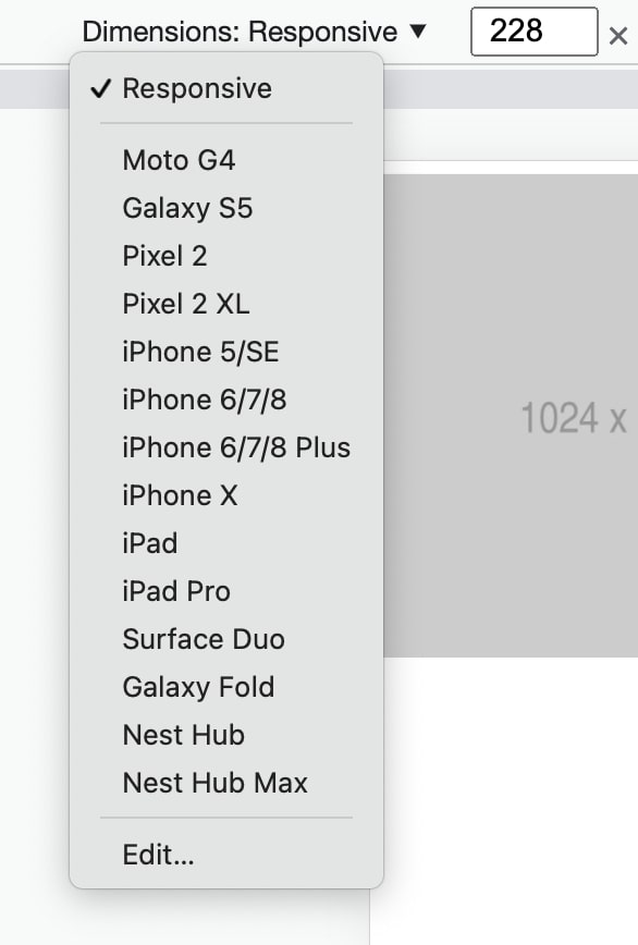
NOW, if your dimensions is in responsive and you manually adjust the width of the screen and drag it to its widest (or even click on any other presets as shown, just choose something big to trigger your next size), you will then notice that your next-sized image will load, flick, and show. You don’t even have to click refresh here, it’ll just show as instructed in your srcset and sizes.
Now here’s the merde de la merde, if you size down again using dev tools to the mobile layout, the smaller image will not show. It’ll just stick to the big version even when you’re in mobile layout, even if your code is correct.
What’s happening is that, since your largest image is loaded in the browser already (you “loaded” this when you resized the responsive layout by manually changing the width to its widest) it’ll use the higher-res photo now since it’s not extra effort to use it. There’s nothing to load, it’s loaded and stored in disk cache already.
It’s smart actually and it’s efficient. I prefer it this way. I JUST WISH THIS WAS NOTED IN SOME DOCUMENTATION SOMEWHERE INSTEAD OF ME FINDING IT OUT MANUALLY.
Again, srcset != determining which image to load
This is me reiterating what I said, since this was my misunderstanding the whole time: neither srcset nor sizes is way to tell your browser ‘which image to use’. I suggest that you try to think of it this way:
When usingsrcset, the browser automatically determines which image to use. If you add insizes, you have some sort of control which image to load at what widths, but remember that ultimately it's still the decision of the browser, at least for now. You can run into a disk cache situation like I did or maybe your responsive design has a specific image for mobile (portrait) and then a different image for mobile (landscape). The moment the user tilts that and load the landscape photo, if they tilt it back to portrait, the landscape photo may still be used (I assume, untested)
EDIT: Multiple sizes attribute and it’s not working as you wanted it to be?!
Here’s my example from above:
![]() srcset="https://via.placeholder.com/375.jpg 375w, https://via.placeholder.com/1024.jpg 1024w"
sizes="(max-width: 400px) 300px, 1024px"
src="https://via.placeholder.com/375.jpg"
/>
srcset="https://via.placeholder.com/375.jpg 375w, https://via.placeholder.com/1024.jpg 1024w"

sizes="(max-width: 400px) 300px, 1024px"

src="https://via.placeholder.com/375.jpg"

/>
Now if you copy-paste this img tag and then dev tools it, if you resize your window to 320, it works (image 375px shows). If you resize it to 401px image 1024 shows. That’s good and that’s what we wanted it to happen.
The big mofo is that if I add a second css condition (and a matching srcset with it), things F up! E.g.:
![]() https://via.placeholder.com/768.jpg 768w, https://via.placeholder.com/1024.jpg 1024w"
sizes="(max-width: 400px) 300px, (max-width: 992px) 768px, 1024px"
src="https://via.placeholder.com/375.jpg"
/>
https://via.placeholder.com/768.jpg 768w, https://via.placeholder.com/1024.jpg 1024w"

sizes="(max-width: 400px) 300px, (max-width: 992px) 768px, 1024px"

src="https://via.placeholder.com/375.jpg"

/> https://via.placeholder.com/768.jpg 768w, https://via.placeholder.com/1024.jpg 1024w"
sizes="(max-width: 400px) 300px, (max-width: 992px) 768px, 1024px"
src="https://via.placeholder.com/375.jpg"
/>
https://via.placeholder.com/768.jpg 768w, https://via.placeholder.com/1024.jpg 1024w"
sizes="(max-width: 400px) 300px, (max-width: 992px) 768px, 1024px"
src="https://via.placeholder.com/375.jpg"
/>Here’s my expectation:
If I resize my screen to 320px, it shows 375px image.
If I resize my screen to 992px, it shows me the 768px image.
All else, the 1024px.
When in reality if I run this new code:
If I resize my screen to 320px, it shows 768px image.
If I resize my screen to 992px, it shows me the 1024px image.
My colleague and I have been burning time on this and pulling hairs like wtf?!?!?dsfdfkljflkwfj
Like all conditions are going one step up?!
Enter devicepixelratio
Turns out, it’s the mu’fu’in device pixel ratio!!!
If you’re coding it right and you know and confident that the underlying logic and syntax of both the srcset and sizes are correct, but it’s still not displaying the correct images in the correct device widths, chances are this is your problem as well. Don’t worry, I figured it out.
So, first that you want to do is open your browser, pull up dev tools > console and then type/run this:
window.devicePixelRatioIt’ll spit out a number: 1, 2, 4, 2.5, whatever. Mine’s 2, for this example. Take note of yours
Basically this is the pixel density of screens and devices. So you remember the times maybe just before Apple introduced their v1 of the retina display? All screens had the same sizes for each pixel.
Basically way back, 1 “pixel” is equal to this 1 tiny, tiny “bulb” (it’s not an actual bulb) in your monitor, right? With technology advancements, they were able to pack more of this now-smaller “bulbs” into the same amount of space that 1 “bulb” used to take (density = 2?).
So if all else were the same, that would mean that your 100x100px image will become visibly smaller, roughly half its size.
This actually happened shortly after more dense displays came out. I remember when I got my Surface Pro 4 and if you go to the settings where you set the resolution or something, everything becomes ultra tiny. After that they had this “suggested” resolution so that everything is still visibly sized the same (but now taking into consideration the new pixel densities).
Going back to my code, so when I ran that, mine’s “2”. So I would assume that my device/screen is 2x as dense. And so I did experiments and what do you know…it checks out.
Here’s my new, correct code; even if it has 2 CSS conditionals:

Notice that the images in my srcset is now twice the size (remember my devicepixelratio = 2?) but the sizes attributes, the css conditionals are still the same?
So now, if you go to dev tools > console and run window.devicePixelRatio , and assuming yours is also “2”, then you can copy paste this code above and we’ll be seeing the same thing. If yours is anything but 2, then just modify the bolded numbers above. You can ignore the 2000 value.
I made it 400/400w because the image slot I have in sizes is 200 x my ratio, which is 2; same with 1536. So just change them accordingly. Do some math.
Now if I go to dev tools and run the entire thing and resize my window to 200px, the 400.jpg shows (specified in srcset) but it’s rendered size is still 200px (specified as the first condition in your sizes).
Then if I resize my window to 992px, it loads 1536.jpg, but rendered as 768px on screen.
If I resize it to 993px, it loads the 2000px.
Now everything works. Everything checks out. The world is fine again. Ffs that took me a lot of trial and error. You’re welcome.
