I enjoy data. Not only is a source of truth and lies (e.g.: cherry-picking), it’s a good stimulant for me every now and then. It practices my mathematical, technical chops. I actually do this every now and then: I’d take a dataset (mostly from open data sources) and just data viz it (data visualization). Remember when I played around with the 31 Most Popular Cities in the World? Now here’s a data visualization of Anyways, this weekend I’m coming off a tourism/travel high. I watched a tourism webinar and just poking at some gc.ca tourism open data here.
It’s a good exercise. It’s a way for another mastery of tools (this one’s just Google Data Studio but I’ve been waiting for a comfortable opportunity to use D3 or something). I was going to nerd out tonight but again, one has to remember: “it’s not about the tool but rather what you want to do with it”.
If you’re not used to the format of my data visualization articles, it runs in the same concept of data: here are the thoughts/raw data. Do what you make of it. Every now and then I may point out some ‘things to note’, assessments, etc but overall my articles like these don’t have conclusions but just information-sharing.
Source
Source: Government of Canada – Open Data
Title: International travellers entering or returning to Canada, by province of entry, seasonally adjusted
URL: https://open.canada.ca/data/en/dataset/4a641926-942a-4045-9938-6294e8e0473a
Here are some interesting facts for Canadians/Ontarians:
Slide 1: Travellers to Canada from 2017-Jan to 2021-Feb
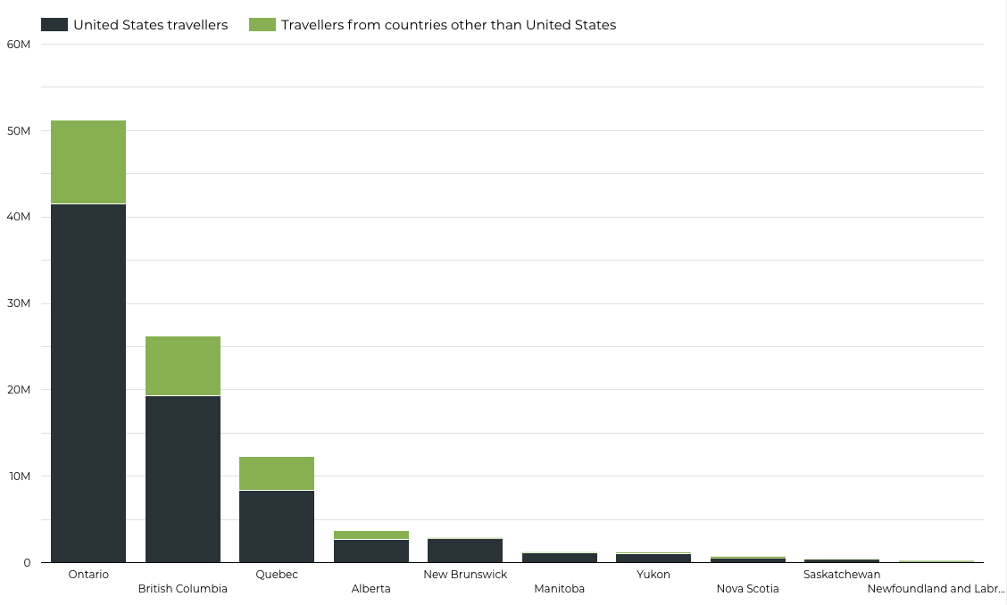
“Why is it just United States or Rest of World?” you may ask. Honestly, I don’t know. I was expecting individual countries to be specified but the dataset in itself just provides “US” or “other countries”.
I was also surprised to learn that it’s US the most by a wide margin. Before opening the data and data visualizing it, I was expecting countries like China, India, various European countries. My theory was since we come from different countries, different backgrounds, maybe the traffic would be from the corresponding countries. Sure I was expecting heavy North / Central American traffic (due to business, trade, and the likes), but I was thinking they’d take 30% at most.
Ps, that's the beauty of data visualization folks: plug the data source, let it crunch the numbers, see the imagery and bam, information automatically assessed and digested in your brain ;)
It would’ve made sense for me too if it was the data for “number of flights from countries”.
Data about returning Canadians are included in the data set but they are filtered out and not included in any of the imagery I’ll be showing you.
Actually you know what, this is a big time range: 2017 to now. Let’s narrow it down a bit more…
Slide 2: Travellers to Canada JUST 2019

Yup, it changed. It’s not the same image. See the Y axis values.
I took 2019 since it’s the latest, non-pandemic year. 2021 data ends at Feb and honestly, how different would it be from 2020 lol.
The data set does not include the purpose of visit btw. Charts like these make you think right. I’m sure it’s business-related….Why Ontario? I get BC since it’s nicer there and I know there’s more traffic there tourism-related. There’s also the “we’re just passing by, trying to get to Alaska” excuse. I would’ve also expected Quebec to be at least second for tourism reasons. Ontario…well I definitely get it and I’m sure it’s predominantly for business (or is Toronto actually a place Americans go to now?!LOL). Are these truckers? I know there are a lot that goes through Niagara/Buffalo. That’s 13M in a year. That’s 35,616 per day. Can there be 20-30k work-related travels per day? Maybe I’m just not comprehending and wrapping myself around this. Maybe this is normal/low numbers in tourism stats.
Also it doesn’t really explain what “United States travellers” mean. As these US citizens or residents? or are these travellers from everywhere else connecting through US?
Slide 3: Travellers to Ontario from Jan 2017 to Feb 2021
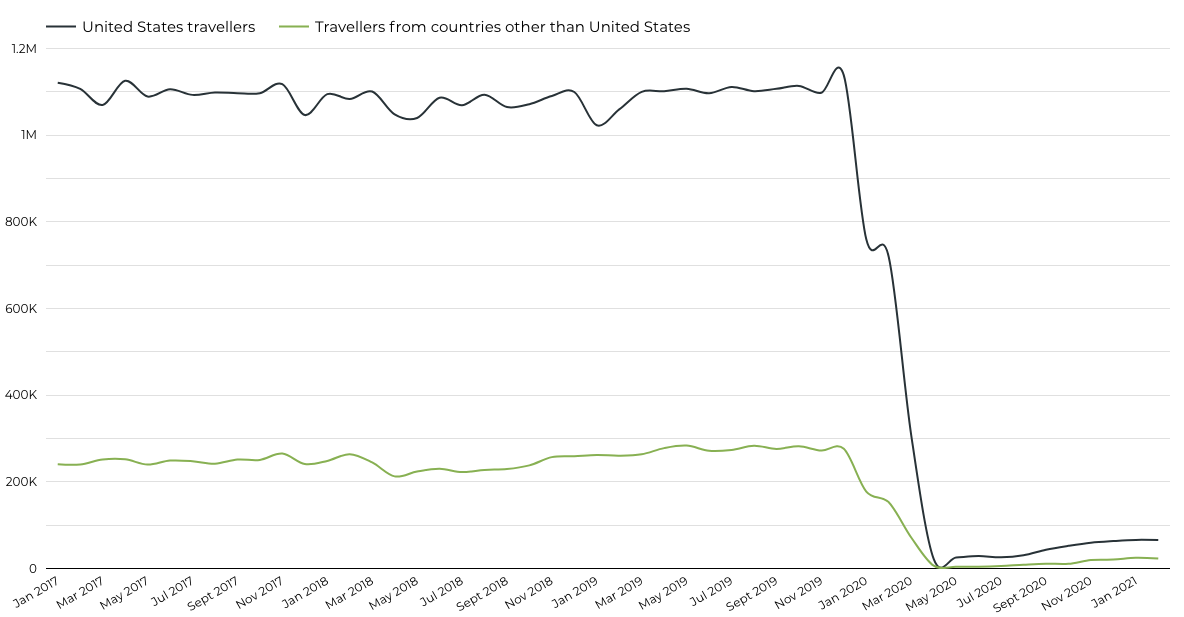
This one is no surprise to everyone (‘Rona).
I was going to deduce something but then again it’s pointless to assume from just one set information. I was going to say that right after the complete travel bans, only essential travels were allow Mar 2020 onwards. So judging by that tiny slope upwards (just above that “May 2020” label), compared to the rest of world, Americans were eager to get back to it. So that means the trips were essential.
Then again you can slice and argue differently wherein “that’s almost a 90-100% drop for Americans so if we assume that most traffic, say 50%, are work-related, then it should’ve then bounced back up to +50%”.
But then again that renders that logic moot. That can due to job losses, cost-cutting measures by companies, etc.
That’s it for now.
I can spend hours on this for my personal enjoyment and/or to find the bottom of the explanation but…those are hours I do not have tonight. I want to kick back 😛 So I’ll further digest this later on for y’all (get it, American 😉 😂) I was really hoping they’d indicate individual countries, ugh.
Here’s the interactive, fullscreen, gives-a-bit-more-detail version. Just enlarge it.